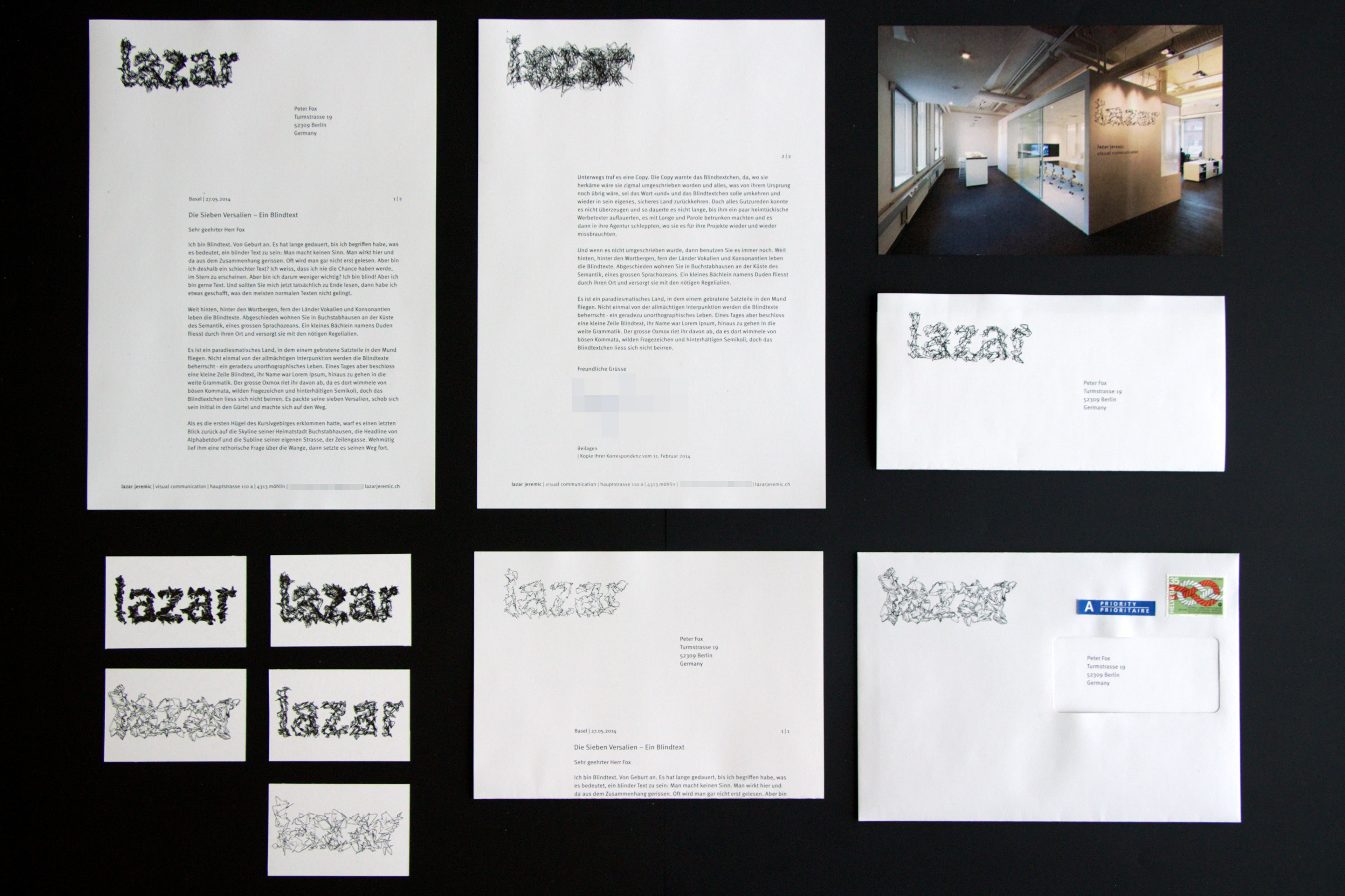
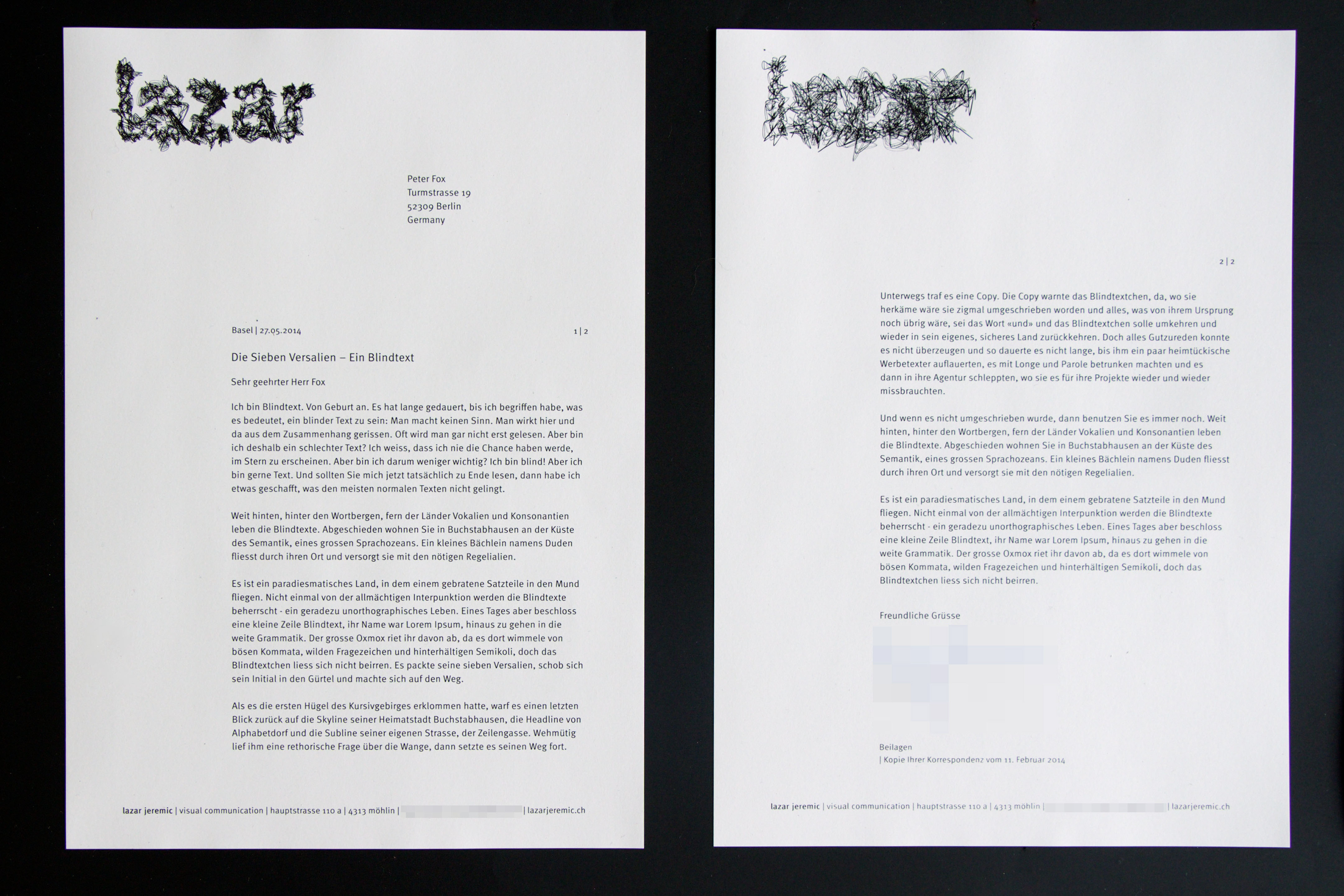
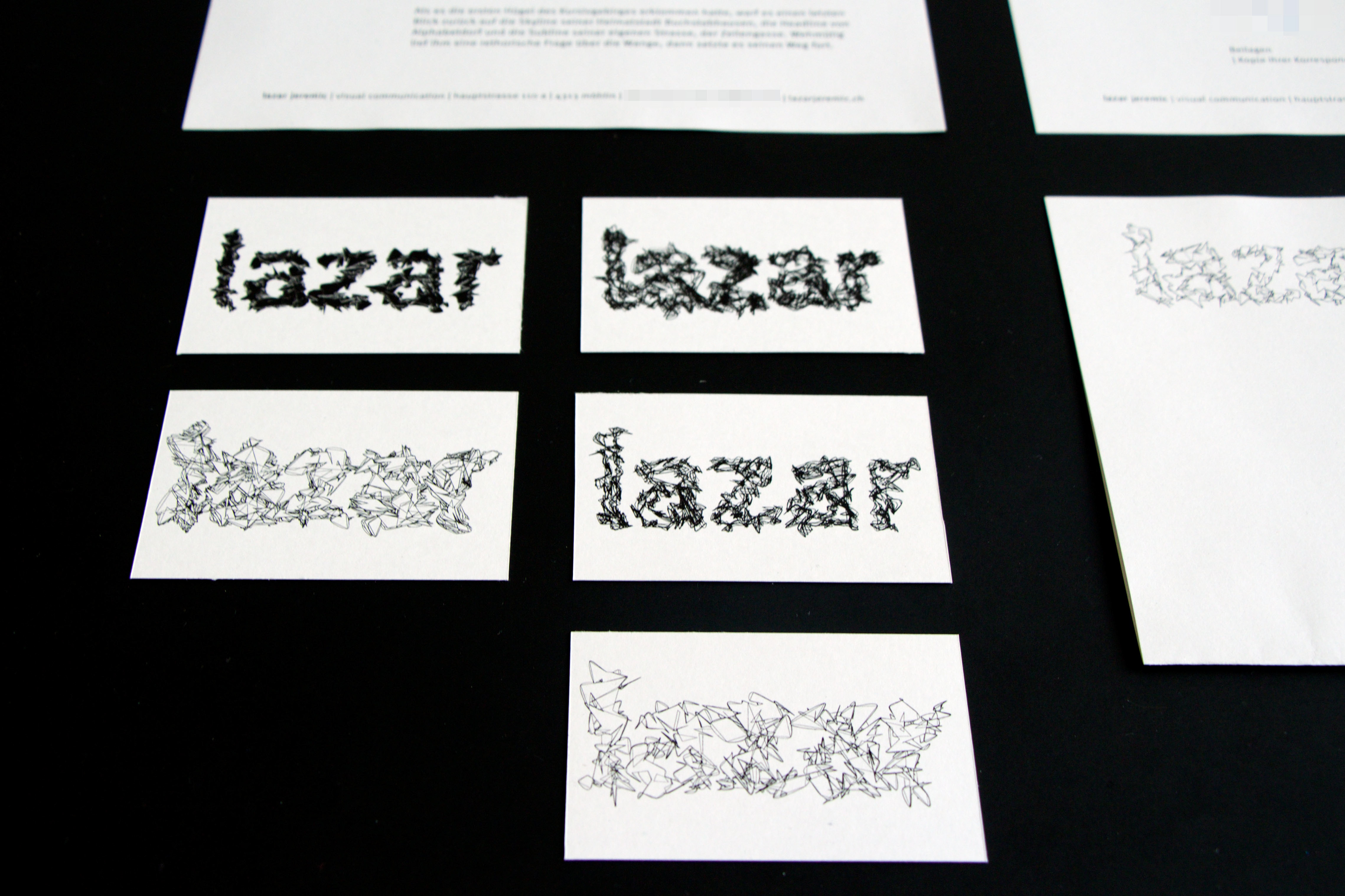
Possibly because my name is rarely heard in the western world, people tend to memorize it very quickly. Especially in combination with my ever-changing out-of-bed hair style. Inspired by this, my visual identity received more of a placeholder, instead of one chosen logo. The outlines and fillings of «lazar» can and will be generated with Processing spontaniously by altering sketches and code on a regular basis. It should be understood as visual playground and therefore ever-changing as well. The rest of the identity is reduced and tidied up as much I feel comfortable with. For better legibility, Erik Spiekermann's «Meta» was chosen as the sole font. The paper has a subtle grey-ish appearance, hence looks kind of «digital».


* Please note, that due to obvious reasons some information has been pixelated.